Scale 1:200
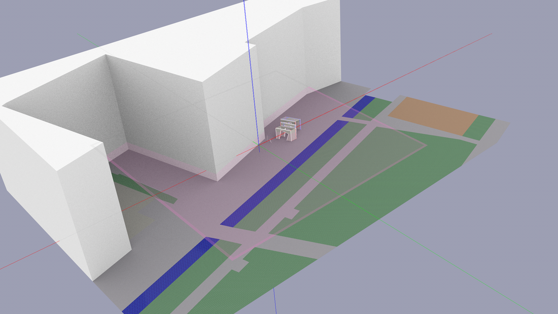
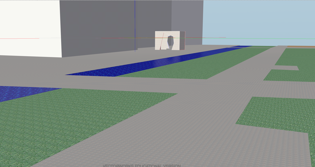
This vector works model is too show the scale and position of my structure against the proposed site I have chosen.
Scale 1:200
|
Scale 1:200 This vector works model is too show the scale and position of my structure against the proposed site I have chosen.
Scale 1:200
0 Comments
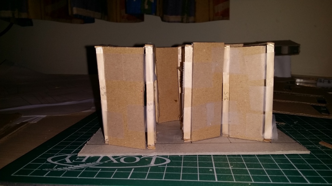
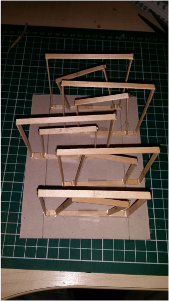
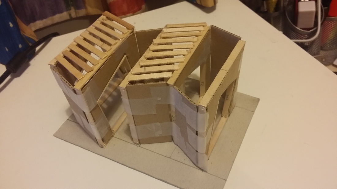  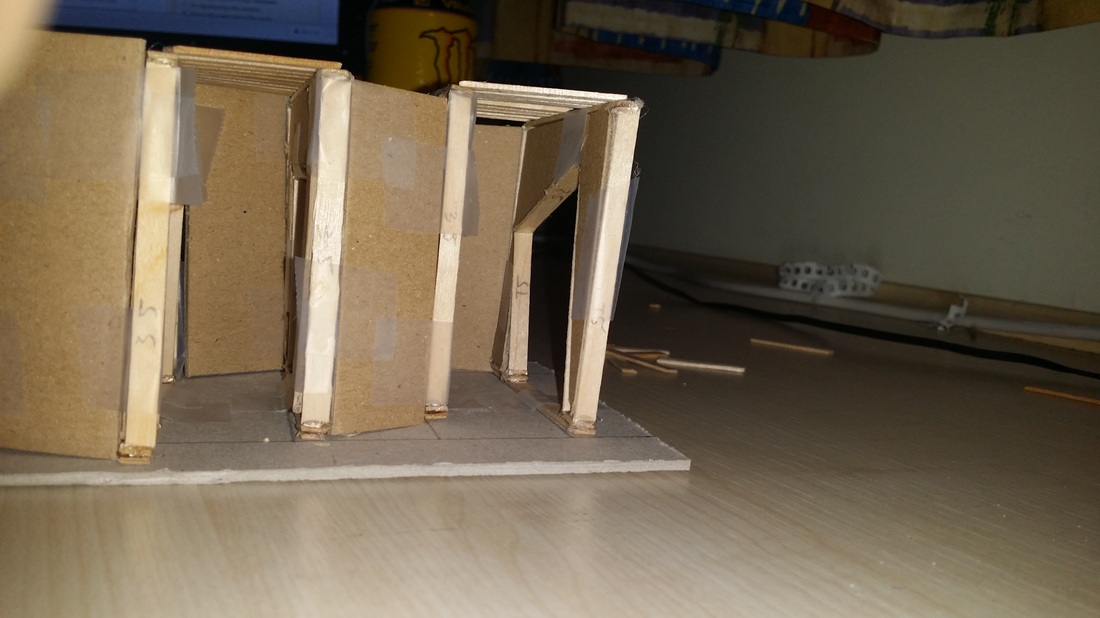 Sketch models, scale 1:50 Again design 3 hasn't changed much from the previous. The only difference is that I have made the overall height of the structure a bit smaller by 500mm and also the width of the 'tunnel' part this was because I felt I was wasting too much of the wall to a walkway that was already too big. The only noticble change is the roof, I wanted to create a roof that gave the sense of still being in a tunnel but still felt open and free, so I tested this and I actually really liked it. It also gives a nice effect from the slats on the roof which looks nice.
The reason for the slats and not a full roof was purely because of light and to feel open so people don't feel trapped in a space. The reason I don't need a standard roof is because graffiti is almost all of the time done outside on walls, buildings etc. The base of the structure will follow the directions of the framework and it will be a three part base fitted together by a tongue and groove system. I want a flat floor so that it too like the walls are a blank canvas for the artists free to do whatever they like. 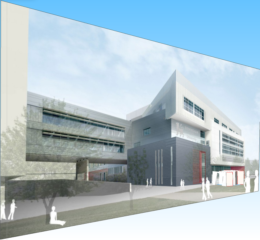 The model of design 2 was created in vector works and for the context of my building regarding to the site I imported a picture of where my building is going to be positioned.
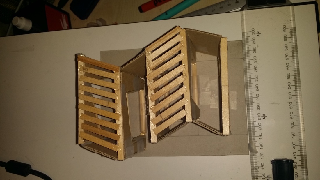
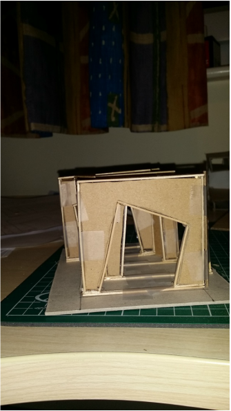 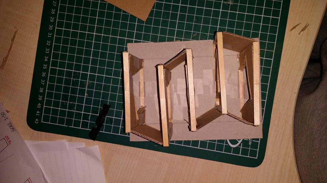  Sketch models, scale 1:50 This design was an evolution from my previous model. The idea behind this design was to create a design like before but to be minimal, trying to create a sense of a tunnel. So by looking at open spaced structures and research into structures, I came up with this design. It has the same amount of panels as previously but they have been moved around to create a broken up structure unlike a typical tunnel but because of the way the boards line up you can still see straight through to the other side like a tunnel.
There were a few things from this model I want to explore and that is to see what the structure and space would be like if I was to create some sort of roof over the top of the space. I don't want to make the space feel to confined because I don't want to take away from what I want to achieve from my intensions and thats to create a space that people can walk through and not feel intimidated like a typical tunnel and for people to be able to move freely through the space. Since the first design I want people to interact with my site in a way that it still has the sense that its a tunnel but at the same time they are free to move in and out of the structure and they don't feel as if they are restricted in their movements. People can interact with site in many ways, because of the positioning of the building it is right out side the BCU Parkside building and down the walk way from Millennium Point. So people going to uni will see the site and have to either walk through the structure or walk beside it, either way they will have to look or engage with the structure. Then because of the structure being so obvious in the middle of the walk way it, it wont be easy to miss from Millennium Point so it will intrigue people to come look at it. The Whole purpose of the structure is for it to be graffitied on by the public. So the 'tunnel' will be left for the public to spray their representation of the city onto the structure. I want people to be able to move in and around the structure feeling different to walking through a typical tunnel whilst seeing artwork around them.
Tunnel graffiti's purpose is to create an environment that promotes graffiti in an artistic way rather than just gang signs and scribbles on a wall. The other reason why I chose a tunnel is because almost every tunnel I have been in has graffiti in, some good some bad. I intend to create an environment that makes people feel at ease as a tunnel can be a very intimidating place, so the idea is to make a design that can complement both. Design 1 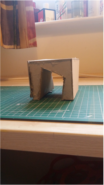 My first design was a good starting point. But after my talk with my tutor it made me realise that all the things that I wanted to achieve I didn't, I just made the same problems but with a twisting passageway through. I needed to achieve a better quality for lighting as it would be very dark in the space and possible feel to confined. Another thing is that because of the restriction people can not interact with the site as much and move freely around it. They are limited to a straight line. So with all this in mind, my next aim is to create a space that can imitate a tunnel and give a presents that it feels and looks like a tunnel but people are free to move through out the structure.
People interact with our site in many ways, Curzon street is home to Birmingham City university and Millenium point science museum. My site is located Just outside the Parkside building for BCU. People will interact with my site as it will be placed right out side the front entrance walkway meaning they will have to either walk through it or around the sides of it but in someway people will have to look and engage with it.
On the 6th September 9,000 people took to the streets of Digbeth, Birmingham when it was transformed into one of the UK's largest outdoor art galleries for the City of Colours festival. A celebration of urban art forms, the streets were turned into a sea of colour, alongside live painting and illustration from over 100 artists, there was break dancing, six music stages showcasing some of the city's best DJs, live illustration battles, beat box battles, a giant POSCA doodle wall, flat land BMX, skaters and more! It really was an event for all the family and the diversity of people who attended was breath taking! Graffiti, dance, photography, screen printing, spoken word and music workshops went on throughout the day, and the market hall couldn't have been busier.
Birmingham has a heavy influence of graffiti work in the area. You don't have to go far to find graffiti. In Digbeth there is a lot of graffiti in the area. It is a rather run down area compared to centre of Birmingham where are the top designer shops, Bullring and all the new modern buildings are housed. A lot of buildings are either not in use and are left so graffiti is seen in almost every direction. For me when I think of Digbeth I cant help but think of the art work and the graffiti there, some eye sore graffiti then others beautiful pieces of art. | AuthorWrite something about yourself. No need to be fancy, just an overview. ArchivesCategories |


 RSS Feed